The CAT City Airport Train has been connecting Vienna’s Schwechat airport with the city’s center since 2003. Today it is taken for granted, but then it was a welcome innovation: fast, comfortable and non-stop travel between the airport and the city’s centre. Vienna had to wait a considerable amount of time for a train like the CAT City Airport Train; today it has become integral to the city and one can no longer fathom Vienna without it.
The design project has received a number of international prizes. The project was commissioned by Flughafen Wien AG (the operator of Vienna’s airport) and Österreichische Bundesbahnen (ÖBB) (Austria’s public rail corporation), which are the joint owners of CAT GmbH. The project has established itself as an international benchmark.
Based on a study by consultancy Roland Berger, Spirit Design developed an underlying innovation and marketing strategy jointly with Marketmind, and has been implementing this in a unique brand and product design since 2002.
Product & Service Design
Experiential value from a jet ambience
The CAT City Airport Train is an express link between Vienna’s airport and downtown. This train meets the requirements placed by its being in a cutting edge metropolis.
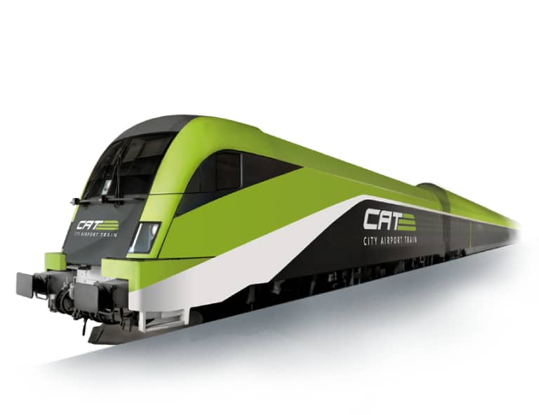
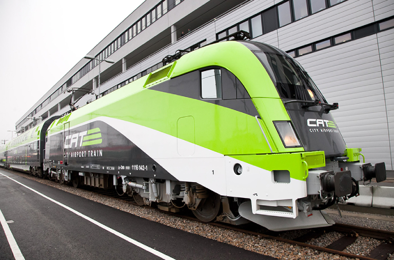
The CAT’s forms, colors and lines evoke associations of dynamism, speed and reliability. This impression is reinforced by the power of the whitely-shining logo. The interior of the express trains imparts to passengers the ambience of a jet atmosphere.
The option of checking-in in downtown constitutes another benefit for travelers, and accentuates the advantages enjoyed by CAT vis-à-vis individual transport. This concept has proven highly successful. Since the commissioning of the train in December 2003, the number of passengers transported by it has increased continually. The brand has also become increasingly known on the international level.
Integrated Brand Design
Express to a world of branding success
Strategy, product, services and brands form a thoroughly-designed entity. It distinguishes CAT from all other means of transportation, and provides passengers with an intensive and positive experience. The CAT features an unmistakable design. It manifests itself on all product and communication levels.
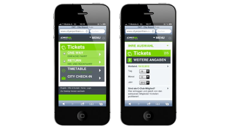
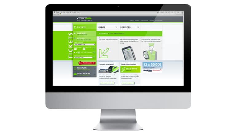
CAT’s design is to be seen in all applications of the brand, with these including both the offline and online areas. It generates recognizability and identification by the client with the offering and brand.
The CAT logo is a symbolic rendering of a train. It thus conveys rapidity. The color scheme is dominated by anthracite and lime green. The dark gray communicates security and responsibility, the light green stands for freshness and dynamism. These attributes are key to the brand’s positioning and branding strategy.
Anthracite plays another role in the designing of the exterior of the CAT: the dark and long stripes situated on the train’s upper and lower sides make it seem lower-slung than it actually is. The stripes thus impart an image of speediness.
Wayfinding system
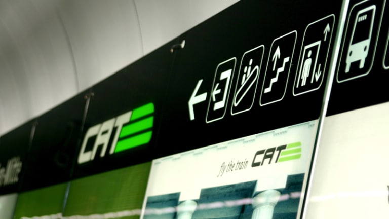
Easy going – passenger guidance system
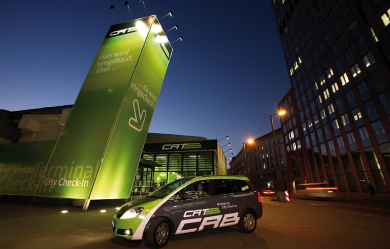
The passenger guidance system joins the interior design in helping travelers get oriented – and in recognizing points facilitating such. The configuration of the platforms and the architecture of the stations adhere, as is the case with all instruments of marketing, the end-to-end CAT branding. The unmistakable orientation systems at the airport and in the station in downtown Vienna are elements shaping the cityscape. They also help passengers quickly find their way. This, in turn, arouses the feeling of trust capable of being engendered only by strong brands.
The challenge comprised the transforming the profusion of signs in Vienna Airport into a guidance system clearly and easily leading passengers to the CAT. This system was optimally located by positioning it at all of the points touched by the streams of passengers.
Refurbishment CAT
Future-oriented Redesign
A project comprehensively refurbishing the CAT was launched in 2010. The challenge comprised the further development of the extant language of forms while incorporating elements establishing the brand’s identity. The objective was to optimize the product.
Sustainable customer experience through a long-term approach to design
To satisfy the needs of a long-term product life cycle, Spirit Design applied – from the inceptions of the project – a concept imparting a timelessly pure, clear and brand-building language of forms to the train’s design. The non-color concept employs the true colors of anthracite, black and silver. These hues are derived from the materials employed. This scheme is complemented by accentuations of green, which is the CAT’s brand color.
This sustainability-enhancing approach to the development of design was instituted at the start of the project. It constituted an optimal basis for its furthering. It also enabled the implementation of the refurbishment project. This guaranteed the sustainably optimal meeting of the promise voiced by the brand. This is performed at the most important points of customer contact. Also guaranteed is the trend-setting further development of the experiences enjoyed by travelers. The redesign was premiered in 2011. It was showcased in the first set of trains, with these including the locomotive.
First-class ambience through a futuristic redesign
The CAT’s form, colors and lines evoke its dynamism, speed and reliability. This impression is reinforced by the strong and whitely-gleaming logo. The brand’s color is green. Its use gives the train a fresh and likeable feeling. The redesign features a greater use of green.
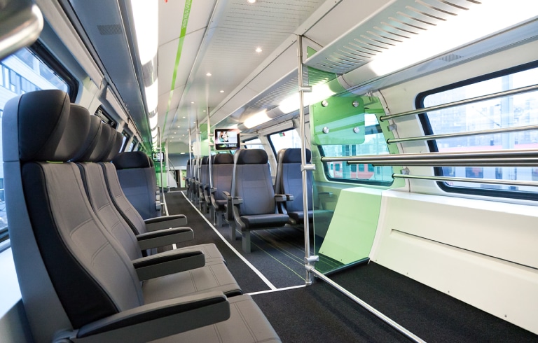
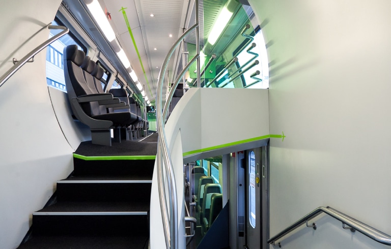
The trains’ interiors have been completed revamped. This included the outfitting of them with further high-quality materials. The revamping thus entailed the replacing of the fabric covering the seats with leather. Even softer wall-to-wall carpets were placed on the trains’ floors. Installed in the trains were translucent green partitions. The painting of the wall elements was freshened up. Added to them were stainless steel elements. The interior of the CAT has been upgraded through the addition of details derived from CAT’s trademark. These details include the green piping on the chairs, the green markings on the floor and the green aviation ribbon disclosing core messages.
The redesign thus maintains the first class ambience expected of travelers using the CAT. The redesign also gives rise to an atmosphere of comfort, friendliness and quality.
CAT CAB
Directly to City Check-In
A few years after the launch of the CAT City Airport Train, the launch of the CAT Cabs followed. The natural gas powered, chauffeured limousines bring the CAT passengers from the city centre to their residence, or pick them up at their residence to drive them to the city centre. The CAT-Cabs are instantly recognisable as part of the CAT-Family thanks to the distinctive branding by Spirit Design. In the CAT-Cabs, the City Airport Train received a further service element that fits firmly into the uniformly designed CAT-brand identity.
