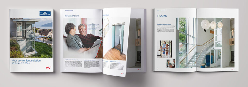
Garaventa Lift is a global company with a broad portfolio of stair lifts and elevators for commercial and residential applications. With its products, the company improves the mobility and comfort of its customers; ensuring their mobility and independence in the long term.
Spirit Design has strategically supported the company with its Design of Vision process; creating the basis for communication with brand essence and brand story and introducing an integrated design language at the brand and product level.
Brand Elements
Shape a coherent brand appearance
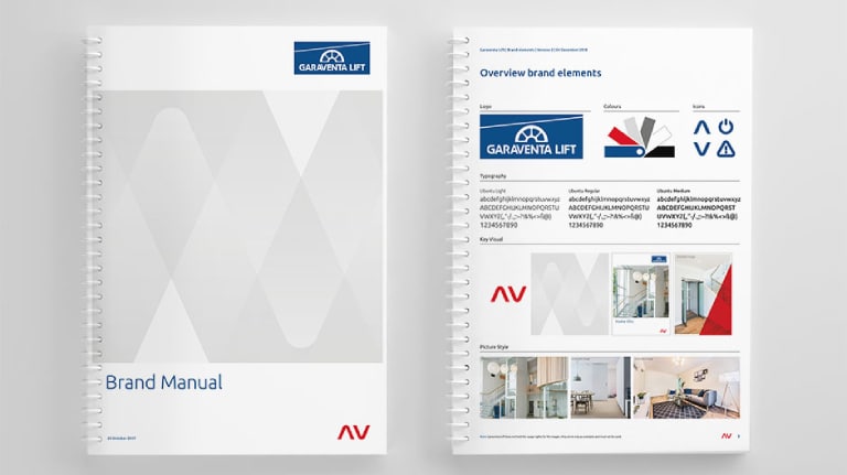
The original logo is still in use in combination with the new Brand Elements: a new font has been selected and the color palette has been expanded to include Swiss Red, alluding to the Swiss origins of the company. The layout characteristics were further developed by defining a pictogram and illustration style and sharpening the picture style.
A newly developed key visual creates brand recognition and structure for the Garaventa Lift brand. The arrows can be used on title pages, as a red accent, as a subtle background pattern in light gray or as a striking information element on the website or the inside pages of print media.





Brand Communication
User centered communication
The products of Garaventa Lift are adapted to the needs of the respective user and the structural conditions. The individuality is not only reflected in the tailor-made product, but also in communication with the defined user groups.
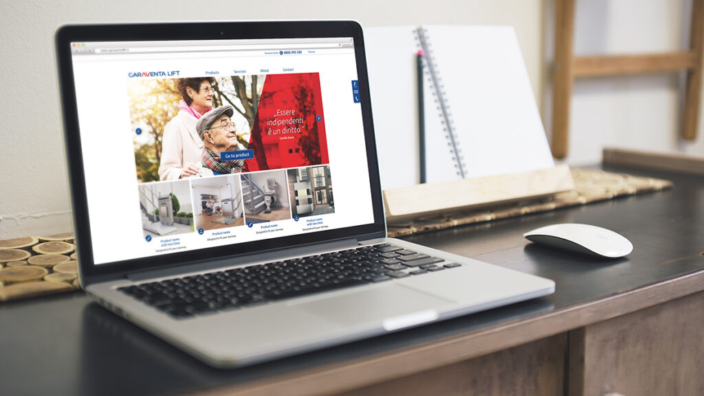
The website addresses the different user groups such as customers (non-technical users) and those who need information from Garaventa Lift (technical users such as architects, property developers, etc.): While some are looking for products and extensive personal services, such as free service hotline to be personally assisted, the others find the information clear and quickly.
