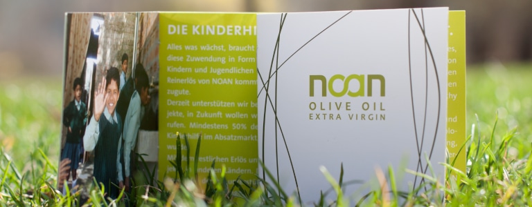
The founding of the Noan Child Foundation is based on the very inspiring idea of an Austrian couple, Margit and Richard Schweger. The company Noan GmbH produces high-quality olive oil in Greece and Italy of 100% organic origin.
At least 10 percent of revenue, as well as the entire net proceeds from sales, will benefit select educational and training projects for socially disadvantaged children to enable them a better future.
Sustainable Brand Core
Noan Olive Oil – Economically Sustainable Action
Noan Olive Oil demonstrates an alternative to how businesses can work: driven by the idea of doing good, but full of professionalism, and based on a well thought-out product with a unique design. This sustainable approach is thus also reflected in the core of the brand.

Branding
Quality for Palate and Eyes
Spirit Design supports the international brand identity of NOAN Olive Oil, positioned as a high-quality product, with a fresh, distinctive branding. To address a targeted, urban and socially engaged population, we consciously avoided focusing on traditional olive oil romanticism. Noan Olive Oil relies on a pure, natural and friendly design that clearly sets itself apart from its competitors.
An olive green hue may have been the obvious colour of choice – but in addition Spirit Design added a lot of white to the colour scheme. This transmits a sense of freshness, nature and purity. The NOAN logo combines the letters O and A in the form of the mathematical symbol for infinity to emphasise the issue of sustainability. Abstractly designed olive leaves playfully form an irregular pattern surrounding the logo.
Packaging
Great Product – Great Packaging
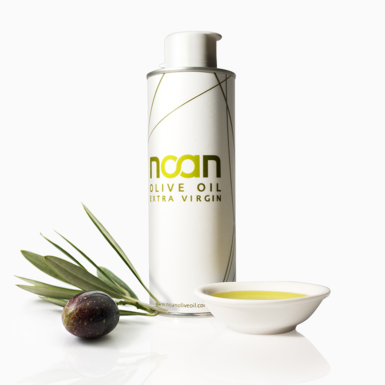
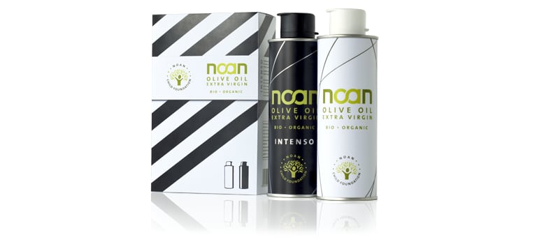
Pure, urban design was also at the fore when designing the packaging. Conducive to the brand strategy, sustainable materials were used. Aluminium, for example, is a highly recyclable material, which can be melted and re-used multiple times without significant loss of quality.
As of today, there is also an additional kind of olive oil, which is already available in five different countries.
CSR Label
Social responsibility as a matter of the heart
Spirit Design also advised Noan on a coherent CSR strategy that would support the brand message in the long term. To present Noan’s corporate responsibility, an appealing symbol was needed that quickly and clearly visualized its eco-social goals. So a logo was created specifically for Noan that, like an organic certificate, is instantly recognizable to any customer and represents the Noan Child Foundation.
With the sprouting olive tree as a symbol, yield and success are transported. The branches and trunk symbolize a child in growth, blossoming and thriving.
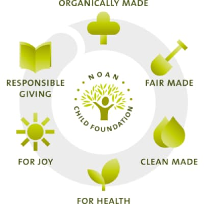
The Noan Child Foundation has set itself the goal of using the yield of the olive trees to provide children with education and encourage them in their growth. The positive label communicates fundamental characteristics of the Noan brand: organic, healthy, honest, inspiring, human, meaningful.
In addition, to present the entire CSR message to the outside world in a simple and concise way, Noan’s sustainability cycle was translated into a pictogram style.

The Future promises Success
It greatly pleases us that since the beginning of the year 2009, the proceeds – and consequently, the donations made – have increased with every harvest. The founders Margit and Richard Schweger have been able to reinforce their team with dedicated members and continue to work tirelessly on this valuable project.
